Hockney: Ode to Invisible Blue

art, art notes, drawing, Exhibition, Painting, philosophy, Sketchnotes, text and image


Hockney’s Retrospective at the Tate Britain.

hockney self p

I used to draw when I visited galleries, but these days I tend to lean less on the pencil, and more on the pen, making word impressions where sketches will not suffice. With notebooks overflowing and piling up around me I’ve decided now to share these reflections, not posing as a critic, but sharing and exploring experiences of art as I have encountered them and felt compelled to pen them from time to time.  

Hockney’s exhibition at the Tate Britain was the first thing I went to see back in London when I got home. I had so many notes that I planned to write a walk-through of the exhibition, a fascinating journey through the work of an ever changing artist. But in the end I found I had enough to say about a single painting for one post. What was surprising was that it was a painting I had seen reproduced, and did not expect to find fascinating. This reminds me that a large part of the ‘work’ that makes an artwork work is that it takes time, attention, and presence. It is the work of the viewer, as well as of the artist that creates an experience. After a long while of looking I felt very attached to this painting, not it’s miniature reproduction on screen, but the vibrating body of the canvas itself. 

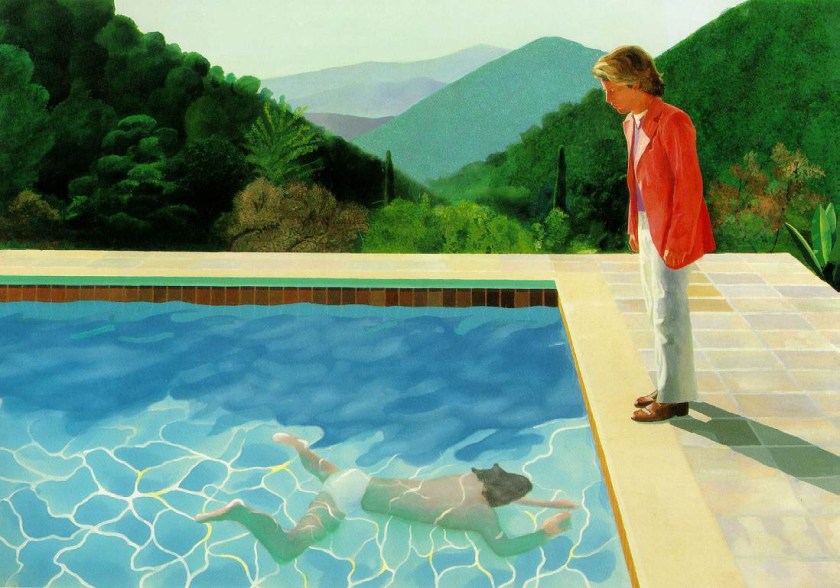
Portrait of an artist 1972 – Pool With Two FiguresDavidHockney-PortraitofanArtistPoolwithTwoFigures. - light
Scale

First of all I need to note that although I have put the image here for reference, it is inevitably limited in in capturing the impression of the real piece which I would estimate to be around three meters wide and two high. The colours also are different in real life, some are brighter, some deeper, some subtler. I’m including a black and white image because I think it leaves room for the imagination to project the impressions described.

DavidHockney-PortraitofanArtistPoolwithTwoFigures. - bw


Summer Skirt Mountain

The use of colour in this picture edges on an impressionist realism, using the standard optical tricks to create spatial illusion, purple mountains, receding objects becoming opaque, tending towards blue and contrasting with the bold, bright, warm colours of the pool and the figures, pitching them to the front of the canvas. The stones around the pool are subtly coloured, and there are remarkable white lines with flashes of yellow in the water that truly seem to dance. These things are not just symbols – they evoke the scene through an artful illusion. And yet the whole effect side-steps realism. Two things stand out to me, the intensely saturated blocks of colour in the water, skin tone and salmon jacket, and the stylized patternation of the middle distance mountain, in floral pastel hues that put me in mind of an old fashioned tablecloth, or a faded summer skirt. These things flatten the spacial illusion. I found this over and over again in Hockney’s work, the play between depth and flatness that makes his pictures self aware, breaking their fourth (or only) wall sometimes harshly, sometimes, as here, with a gentle whisper.

Draft Line, “I drew this…”

Although the foliage of the mountains to the fore is more detailed, varied and realistic, the initial sketch lines of their gradients show through the trees that have been painted on top. In an image so consummately painted, controlled and detailed, leaving evidence of the drafting process can only be intentional. And so with this, and the domestic patterned mountain the painting becomes self aware, self conscious of its draftsmanship and decorative potential. The painting says “See this scene.” it also says, “I drew this scene, and then I painted it.”

We, The Watchers

The draft line of the ridge on the right passes behind the head of the standing man, tracking his gaze and drawing our eyes down to follow his view of the swimmer. It is a line of tension. We watch the swimmer with the man in the pink jacket at the pool edge. The sense of watching, and waiting, is static in a way that might be broken at any moment, like the surface of the pool. We are drawn into the scene as participants, sharing a view, “Look”, says the picture, “Let’s watch and see…”

Invisible Blue

I am most impressed by the heavy, soft blue of the body of water that hangs in shadow above the swimmer. It functions so well that it took me a long time of observing the painting to really notice it, despite being a potentially dominating colour and hue, and so boldly placed right across the middle of the canvas. It is a quarter of the painting’s height and two thirds of its length. And it’s almost empty, courageously so. There is some colour shift but no detail, nothing happening. It is painted quite roughly in comparison to other parts of the picture, and it is that emptiness and vagueness lets the eye pass over it without catching. Like meeting the pole of an opposing magnet, your eye rolls over the thick blue mass and lands instead on the bright colours and stark shapes that surround it. The deep hue, the soft and solid nature of this block of water in shadow throws the ephemeral swimmer and streaks of living light out towards the viewer. This blue is the drummer in the band, the broad base line off which the colourful melody plays. Or perhaps it is the silence, the space between notes that allows them to strike out with such clarity. Although as a portion of paint in itself, gloriously and deeply blue, it does not display the finest of Hockney’s talents, it is used in exquisite harmony with its surroundings and demonstrates his deftness with both colour and composition. So I make this short stock of observations an ode, to the invisible blue.

By happy chance today I came across a history of blue pigments

I cannot find a digital reproduction of this image that satisfies my memory of this blue. In the picture at the top of this blog it is far too light. Screen reproductions, besides being flat and small, also play with colour and tend towards brightening everything. The more I learn about colour theory the more I realize that the mixing of colour through light (screen) and pigment (paint) are fundamentally different. The picture below has a better sense of the blue, though all else is much too dark, you get a better impression of the light and shadow in the water.

DavidHockney-PortraitofanArtistPoolwithTwoFigures. - DARK bluejpg

If you have a chance to go and see the actual painting, (and get your own impressions!) and the whole exhibition then please do go. It’s on at the Tate Britain until May 29th. And besides this picture there is a wealth of artwork from Mr. Hockney’s varied and fascinating works.

I would very much like to write about Hockney’s in terms of his relationship with photography but…. He has written and spoken so eloquently about this that first and foremost I suggest anyone who is interested see his documentary on the historical use of camera obscura and camera lucida by many of the revered artists of the past, “Secret Knowledge”. I honestly couldn’t recommend this more if you have an interest in the history of western art and the ways we have learned to see, understand, and construct the world around us as a culture.


Thanks for reading my first ArtNotes post.

More soon from BlancheEllisArtNotes  
IMG_20170114_215058_052.jpg

Noticias: What I’ve Been Up To…

art, drawing, Drawing in Public, Drawing in Public, Illustration, Painting, portrait, Prints, sketchbook, Sketchnotes, text and image

So I realize it’s over two months now since I left England, packed all my paints, charcoal, inks, pens, papers and a few clothes, and came to Barcelona.

IMG_20170223_131247245

My three month trip has morphed into a six month one and I am completely at home for the moment. Home is in two parts, a room with light, a view over the city, an easel, and white walls becoming a patchwork of line and colour, and a communal studio where I spend my evenings painting from life alongside the Catalan retirees of Barcelona. This is also, pretty much, my social life.

And it fits.

IMG_20170227_215711_370

Trying to find my way back into oil painting and really understand it, i’ve been taking a lot of process shots which has resulted in these little animations which I love. Sometimes my favorite part is an in-between, unfinished stage – reminding me that sometimes you have to  just stop! This one was done on a portrait i had scrapped and sanded down.

20170227_211055-ANIMATION 

Not only painting, I’ve had some great models, known and strangers and been drawing –

A LOT.

_DSC8289-7 (2)

Some of these drawings are already up on Etsy and the shop is looking more spry than ever, and, much more representative of my current work. No painting up there yet but i’ll bargain on it soon!

Drawing from movement and dance has been the best thing…. finding  where observation, memory and imagination meet, giving each its space and letting them play together…

IMG_20170312_132428_970

See my works in progress on Instagram @BlancheEllisArt 

.

Also, in MUSIC NEWS...

I’ll be playing solo as part of a showcase on April 1st at The Boarderline for Before The Gold Rush….

In my absence the EP I recorded last autumn with Maya McCourt as Various Guises has had some airtime on BBC – Radio 6 – (listen here). And, the stunning film, Purple Heather by Alfie Dale, for which we wrote some music has been finished! see the trailer here:

Purple Heather

img_20161122_210144

More to come soon.

x

Blanche

Looking back, and forwards….

art, drawing, Drawing in Public, Exhibition, folktale, Illustration, location drawing, location painting, Market Stall, portrait, Prints, reportage, sketchbook, text and image

So, I hear it is a new year. I thought, seeing as I’m sitting in bed with the flu, I’d use the time to reflect on a few things that happened this last year, and where I’m going next….

Jagriti Yatra

This last year that has had me drawing on windows in high rise buildings, sketching at festivals, partaking in several exhibitions and starting new series’ and collaborations…. began, what feels like a long time ago, on a train.

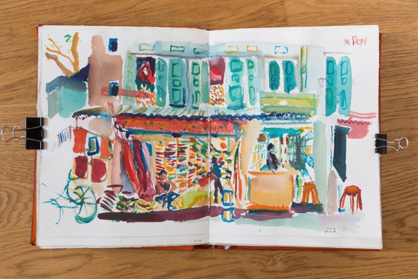
I was traveling the width and breadth of India with the Jagriti Yatra, a charity for young social entrepreneurs. Working with with my colleague and good friend Temujen Gunewardena we captured the two week train ride in a 15 meter long illustration….

thumb_IMG_7171_1024

and all the while I kept a personal sketchbook of our travels…

_MG_0891

Mythologies Series

In the late spring I made a call out for an author to create written illustrations for this series of over 40 drawings and their myriad cast of eccentric characters.

IMG_20160704_150922

Since then I have been working in collaboration with the Ines Ferreira a visual artist, maker of art-books and author of humorous, strange and serious, magic-realist worlds. I entrusted Inez with my Mythologies family and have loved reading the stories that have emerged. The concept, of creating a book or exhibition from this combined work, continues to develop in response to the work.

I cannot wait to read more and find the full shape of this series but I am also enjoying the slow pace. The project has a staying power,  I so often quickly abandon finished work for the next project, it a great practice to keep returning to pull more threads from the initial fibre.

Portraits At The Ashmolean

I spent a great evening in the spring at the Ashmolean museum in Oxford as ‘The Wandering Portrait Artist’, creating colourful portraits of the guests at the museum’s Andy Warhol inspired Portraits night.

Portrait - 8

Black and White

My usual palette is fresh, bright and bold, full of citrus, sun and luminous shadows. The Ashmolean project pushed my colours to pop-art saturation… but, in the autumn, I had a brief period of black and white.

img_20161025_183622

This series was twice as unusual because I was not only working predominantly in black and white, I was working from photographs rather than from life, or from my mind. The effect was rather like collage, taking elements from my own photographs and other images and interweaving them to create cryptic narrative scenes. This series was exhibited at the Creative Connections studios in East London in November.

img_20161008_134816

Various Guises EP

November saw the launch of the Tide Take Him EP by the folk duo, Various Guises, myself and Maya McCourt. I was able to bring my art and music together in artwork for the EP and in song illustrations. I curated an exhibition at the launch and exhibited the EP artwork alongside the work of other artists on the theme.

img_20161122_210144

Etsy Shop

Having clambered onto the social media of Instagram the year before I forged even further into the world of zero’s and ones this year by opening an ETSY shop… currently it is stocked with prints and framed work and I look forward to putting more original work up.

Believe it or not – it seems to be working, I have so far sold prints in the UK, Austria, Australia and the USA !

Colourful Nudes

As December grew darker and greyer, I began a new series of delightfully colourful, naked ladies with extremely strange hair.

img_20161222_133812_128

 The Christmas Market

In December I also returned, almost by surprise, to Christmas Markets for the first time in 3 years, and had a fantastic time. It’s that lovely feeling of selling your work to someone personally, knowing where it is going to and what kind of home it may have…

img_20161209_134307695_hdr

I sold a lot of original work including two members of the Strange Familiar’s, another series that mixes text and image in a short story, or mysterious narrative, style. The rest of the Strange Familiar family may be found in exhibition in 2017

and last but by no means least…

Crisis

I had the privilege and pleasure of working with Crisis this year as a volunteer, making portraits of the guests, giving drawing classes and helping in any other (totally unrelated) way I could. There is something in a portrait, that means you have been seen, and recognised. There is also a connection that is made by sitting face to face with someone for ten minutes, completely aware of one another without having to talk, only letting conversation come of its own accord. Many guests kept the portraits, others sent them to family, to their kids or mothers. I don’t think could use ink, paint or graphite in a better way. I’m very grateful for the experience.

img_20161229_111155_107

What next?

On Friday I leave for Barcelona for a period of self-directed study. Very little is decided except that my oil paints are coming with me and I plan to wrestle the caps off the tubes where they have gummed up and become stuck from lack of use. Drawing will continue, of course… and the rest, is all adventure. The main question is if there will be space for clothes in my suitcase, when all the art materials are in there.

And, of course, the eternal question of wether the gods-that-be will allow my banjo on as hand luggage.

¡Adios!

Ongoing CALL OUT to Authors and Poets – Textual Illustration for The Image.

art, Design, drawing, metamorphosis, Painting, poetry, press, Prints, Quotes, short story, text and image

In reverse of the usual order…illustrating drawings with text… to be combined into a book, and exhibition.

I’m still looking for contributors/collaborators for this project.

There are over 40 artworks to be illustrated and I’ll be publishing them gradually here and on my social media @BlancheEllisArt as the project progresses… so keep an eye out here. I may also be putting up snippets of the writing I’ve received… with permission of the authors.

_MG_7071

Changing shape…

Even since I posted about this last week the idea has developed, mostly because of the amazing responses I’ve had already from friends, strangers, other artists, an art-book maker and poets and authors from different backgrounds, and languages. And have found many secret authors in my acquaintances.

I’m so happy to be receiving this fount of creativity!   

_MG_7056

Words lead words… 

It’s even leading me to write myself, in an attempt to track what I am looking for. Other people draw out my words with their own wonderful phrases and I feel the pitch, the roll and magnetism of the word collaboration, a force all of it’s own… changing the shape of my intension as it unfolds. Perhaps a preface…

“Word-turns apt in riddle and rhythm to trip and roll the mind causing backtrack, retrace, and circled in so turning, the sentence sense embraced. The way a picture leads the eye, not forward to finality but, with concentric in-conclusions, as a dance that makes sense-of-a-step does so by leading you both too-and-fro and leaving you, not locked, but poised by punctuation.”

_MG_7061

Drink Me –

The Story-World…

The initial idea was that each piece of text be another ‘moment’ from the images story-world, a suggestion or clue that opens up the narrative to further interpretation rather than attempting to complete, or explain the picture itself. Instead of finished stories I’m looking for writing that echoes or extends the sense of mystery and magical-realism, and may do so without obvious reference to the image itself. It could be specific, detailed, atmospheric or impressionistic. All and any ideas appreciated!

As the project opens up I think the writing could be in anthropological, an impossible recipe, a critique of a non-existant novel (think J. L. Borges), a short letter, a completely brazen critique of a character, or of the picture itself .

Ideas abound

Please share any ideas here or by email at blancheellis@gmail.com

See more of the images on Instagram and in the previous post and call out

Thank you for stopping by!

b