
Hockney’s Retrospective at the Tate Britain.

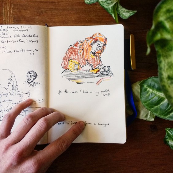
I used to draw when I visited galleries, but these days I tend to lean less on the pencil, and more on the pen, making word impressions where sketches will not suffice. With notebooks overflowing and piling up around me I’ve decided now to share these reflections, not posing as a critic, but sharing and exploring experiences of art as I have encountered them and felt compelled to pen them from time to time.
Hockney’s exhibition at the Tate Britain was the first thing I went to see back in London when I got home. I had so many notes that I planned to write a walk-through of the exhibition, a fascinating journey through the work of an ever changing artist. But in the end I found I had enough to say about a single painting for one post. What was surprising was that it was a painting I had seen reproduced, and did not expect to find fascinating. This reminds me that a large part of the ‘work’ that makes an artwork work is that it takes time, attention, and presence. It is the work of the viewer, as well as of the artist that creates an experience. After a long while of looking I felt very attached to this painting, not it’s miniature reproduction on screen, but the vibrating body of the canvas itself.
Portrait of an artist 1972 – Pool With Two Figures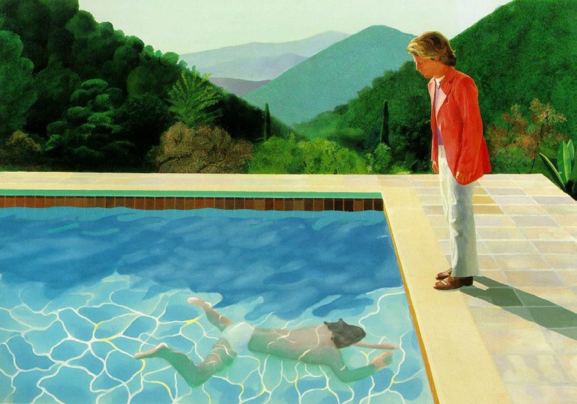
Scale
First of all I need to note that although I have put the image here for reference, it is inevitably limited in in capturing the impression of the real piece which I would estimate to be around three meters wide and two high. The colours also are different in real life, some are brighter, some deeper, some subtler. I’m including a black and white image because I think it leaves room for the imagination to project the impressions described.

Summer Skirt Mountain
The use of colour in this picture edges on an impressionist realism, using the standard optical tricks to create spatial illusion, purple mountains, receding objects becoming opaque, tending towards blue and contrasting with the bold, bright, warm colours of the pool and the figures, pitching them to the front of the canvas. The stones around the pool are subtly coloured, and there are remarkable white lines with flashes of yellow in the water that truly seem to dance. These things are not just symbols – they evoke the scene through an artful illusion. And yet the whole effect side-steps realism. Two things stand out to me, the intensely saturated blocks of colour in the water, skin tone and salmon jacket, and the stylized patternation of the middle distance mountain, in floral pastel hues that put me in mind of an old fashioned tablecloth, or a faded summer skirt. These things flatten the spacial illusion. I found this over and over again in Hockney’s work, the play between depth and flatness that makes his pictures self aware, breaking their fourth (or only) wall sometimes harshly, sometimes, as here, with a gentle whisper.
Draft Line, “I drew this…”
Although the foliage of the mountains to the fore is more detailed, varied and realistic, the initial sketch lines of their gradients show through the trees that have been painted on top. In an image so consummately painted, controlled and detailed, leaving evidence of the drafting process can only be intentional. And so with this, and the domestic patterned mountain the painting becomes self aware, self conscious of its draftsmanship and decorative potential. The painting says “See this scene.” it also says, “I drew this scene, and then I painted it.”
We, The Watchers
The draft line of the ridge on the right passes behind the head of the standing man, tracking his gaze and drawing our eyes down to follow his view of the swimmer. It is a line of tension. We watch the swimmer with the man in the pink jacket at the pool edge. The sense of watching, and waiting, is static in a way that might be broken at any moment, like the surface of the pool. We are drawn into the scene as participants, sharing a view, “Look”, says the picture, “Let’s watch and see…”
Invisible Blue
I am most impressed by the heavy, soft blue of the body of water that hangs in shadow above the swimmer. It functions so well that it took me a long time of observing the painting to really notice it, despite being a potentially dominating colour and hue, and so boldly placed right across the middle of the canvas. It is a quarter of the painting’s height and two thirds of its length. And it’s almost empty, courageously so. There is some colour shift but no detail, nothing happening. It is painted quite roughly in comparison to other parts of the picture, and it is that emptiness and vagueness lets the eye pass over it without catching. Like meeting the pole of an opposing magnet, your eye rolls over the thick blue mass and lands instead on the bright colours and stark shapes that surround it. The deep hue, the soft and solid nature of this block of water in shadow throws the ephemeral swimmer and streaks of living light out towards the viewer. This blue is the drummer in the band, the broad base line off which the colourful melody plays. Or perhaps it is the silence, the space between notes that allows them to strike out with such clarity. Although as a portion of paint in itself, gloriously and deeply blue, it does not display the finest of Hockney’s talents, it is used in exquisite harmony with its surroundings and demonstrates his deftness with both colour and composition. So I make this short stock of observations an ode, to the invisible blue.
By happy chance today I came across a history of blue pigments
I cannot find a digital reproduction of this image that satisfies my memory of this blue. In the picture at the top of this blog it is far too light. Screen reproductions, besides being flat and small, also play with colour and tend towards brightening everything. The more I learn about colour theory the more I realize that the mixing of colour through light (screen) and pigment (paint) are fundamentally different. The picture below has a better sense of the blue, though all else is much too dark, you get a better impression of the light and shadow in the water.

If you have a chance to go and see the actual painting, (and get your own impressions!) and the whole exhibition then please do go. It’s on at the Tate Britain until May 29th. And besides this picture there is a wealth of artwork from Mr. Hockney’s varied and fascinating works.
I would very much like to write about Hockney’s in terms of his relationship with photography but…. He has written and spoken so eloquently about this that first and foremost I suggest anyone who is interested see his documentary on the historical use of camera obscura and camera lucida by many of the revered artists of the past, “Secret Knowledge”. I honestly couldn’t recommend this more if you have an interest in the history of western art and the ways we have learned to see, understand, and construct the world around us as a culture.
Thanks for reading my first ArtNotes post.
More soon from BlancheEllisArtNotes